Your website is your digital storefront. It works while you sleep, answers questions while you're busy, and either builds trust or destroys it in the first three seconds.
Most business owners think their website is "fine." But fine doesn't convert. Fine doesn't build trust. Fine is invisible.
Here are five ways your website might be actively repelling the people you want to attract — and what to do about each one.
1. It takes more than three seconds to load
You know the feeling. You click a link, the screen goes white, and you feel the urge to hit the back button before the page even finishes loading. Your customers feel the exact same way.
Google research shows that as page load time goes from one second to three seconds, the probability of a visitor bouncing increases by 32%. At five seconds, it's 90%.
How to check: Open your site on your phone using mobile data (not WiFi). Count. If you can make a cup of coffee before your homepage appears, you have a problem.
Quick fixes:
- Compress your images. Tools like TinyPNG or Squoosh can shrink a 2MB photo to 200KB with no visible quality loss.
- Remove auto-playing videos and heavy animations.
- If you're on WordPress, audit your plugins. Each one adds weight.
2. Your homepage doesn't say what you actually do
I see this constantly. A beautiful hero image. A vague headline like "Empowering Your Vision" or "Solutions for Tomorrow." A button that says "Learn More.”
A visitor lands on this page and thinks:
Who is this for?
Am I in the right place?
What do you actually sell?
They should not have to dig through your "About" page to understand your business.
The fix: Write a headline a stranger could understand in five seconds. Use this formula:
We help [specific audience] [solve specific problem] so they [get specific result].
Bad: "Innovative digital solutions for modern businesses."
Good: "Web design for small law firms that need more client calls."
3. There is no easy way to contact you
This sounds obvious, but hide-and-seek is not a good business strategy. I have seen websites where the contact page is buried in a dropdown menu, the phone number is only on the footer, and the contact form has six required fields including "Company Size" and "How Did You Hear About Us?"
Every extra click and every extra field kills conversions.
The fix:
- Put your phone number and a "Contact" link in your top navigation on every page.
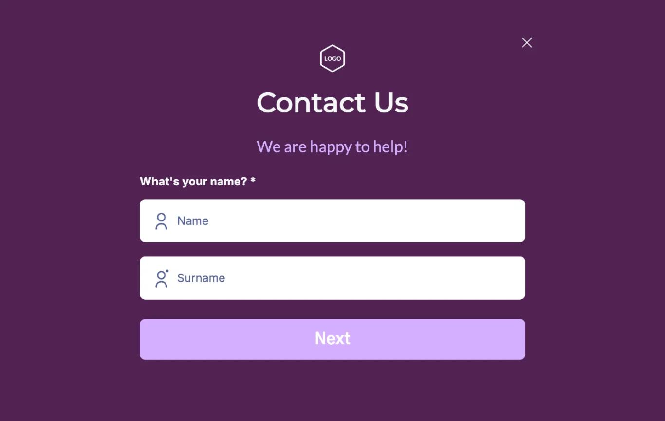
- Limit your contact form to three fields: Name, Email, Message. Maybe phone number if you actually call people back.
- Add your email or a simple chat option if you prefer text communication.
Make it easier to reach you than to leave.
4. It looks like it was built in 2012
Design trends age faster than you think. Rounded glossy buttons, stock photos of people in suits shaking hands, Comic Sans, cluttered sidebars—these signal "this business is outdated or inactive" before a visitor reads a single word.
People judge trustworthiness in milliseconds based on visual design alone. A dated site suggests a dated business.
The fix: You don't need a $10,000 redesign.
You need:
- Clean, readable typography (one or two fonts max).
- Plenty of white space. Let your content breathe.
- Real photos of your real business, not stock images. Even phone photos of your workspace beat generic corporate handshakes.
- A modern color palette. If your site still uses bevels and gradients from the skeuomorphism era, it's time.
5. There is no proof that you are real
Anyone can build a website. A teenager can spin up a convincing landing page in an hour. What separates real businesses from scams and vaporware is social proof.
If your site has no testimonials, no client logos, no case studies, no photos of real humans behind the business, visitors will assume the worst. Not because they are cynical, but because they have been burned before.
The fix: Add at least one of these to your homepage:
- Testimonials: Real quotes from real clients, ideally with names and photos.
- Case studies: Even a single "How we helped [Client] increase [Result] by [Number]" builds massive trust.
- Team photos: Show your face. People buy from people, not anonymous brands.
- Trust badges: Industry certifications, years in business, number of clients served.
The hard truth
You are not the best judge of your own website. You built it, or paid for it, or inherited it. You see your intentions. Your customers see only what is in front of them.
The good news: these five problems are all fixable, usually without a complete rebuild. Most of them are content and messaging issues, not technical ones.If you read this and thought, "My site does three of these things," you're not alone.
Most small business websites do. The ones that win are the ones that fix them.
Want a second opinion?
I record free website audits for business owners who suspect their site is costing them customers. Send me your URL and I'll tell you exactly which of these applies to you—and how to fix it.
Here’s my portfolio site: https://nafizdevportfolio.vercel.app/